VŠE Falcons Prague — Building a Hockey Club's Brand from Zero
Where it started
VŠE didn't have an official hockey team in the university league. A group of us already played together, so we decided to build the thing that didn't exist yet and put our school on the ice.
That meant starting from absolute zero. No name, no crest, no colors, no channels — just five founders, an idea, and a standing weekly meeting. We took the project from a first sketch in a café all the way to printed jerseys and the first signed partners, moving it forward week by week.
The idea behind the name
We landed on Falcons for two reasons, and the second is the one I care about most. On the surface, it captures how we wanted to play — fast, sharp, strong, on the ice and in the classroom. But it also reaches back into VŠE's own history and its sports tradition, TJ Sokol the Falcon, connecting the school's past to a brand-new team. The name isn't decoration; it's the club's story in one word.
Building the identity
From there I built the visual system to do three jobs at once: feel modern, work across every format, and above all be memorable to students — the people we needed in the stands.
That last point drove the color and design decisions. A crest and palette that read as cleanly on a jersey as they do on an Instagram story, that hold up in an animated intro and on a printed roll-up. One coherent world, whatever it's stretched across:
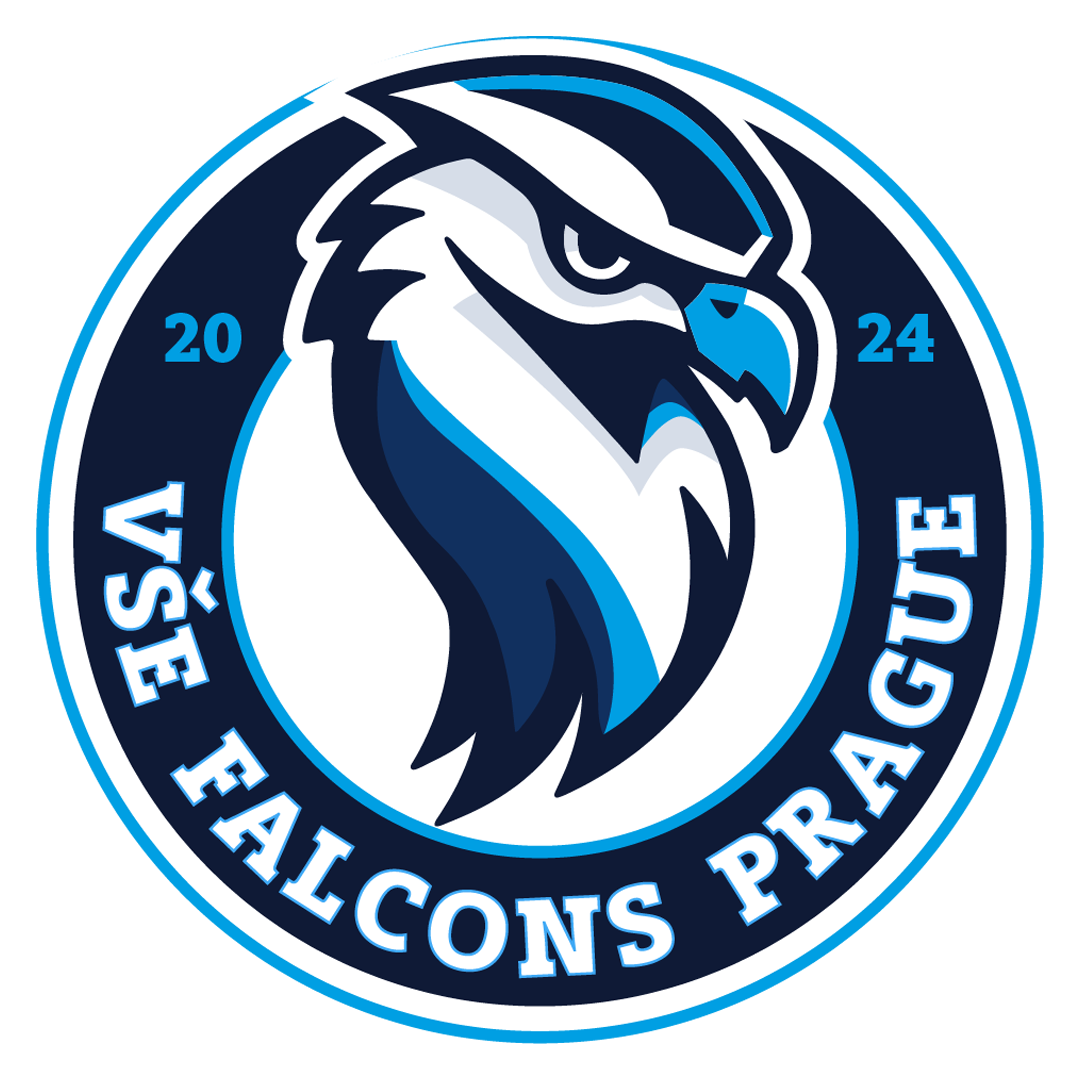
- Crest & brand system — the falcon mark and the visual language everything is built on:
- Jerseys — the identity carried onto the ice
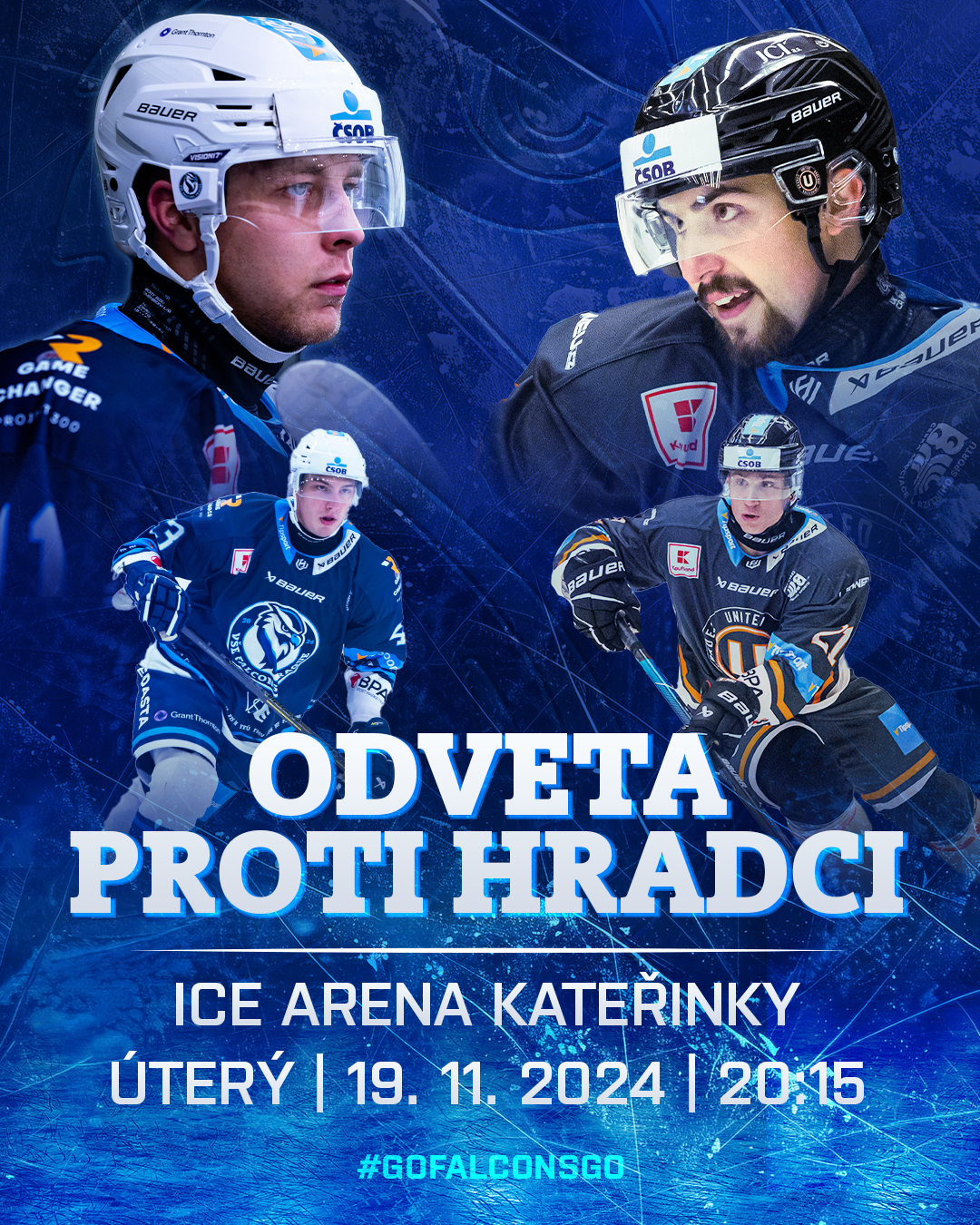
- Matchday graphics — a repeatable system for game announcements, results and hype
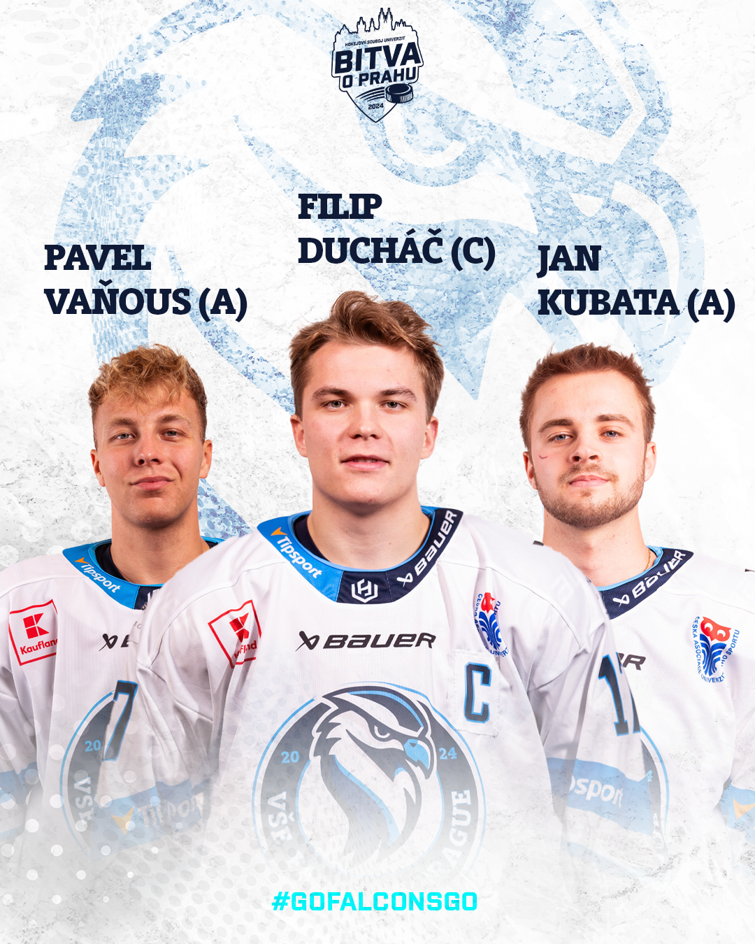
- Player cards — a consistent template across the whole roster
- Motion — an animated playoff intro
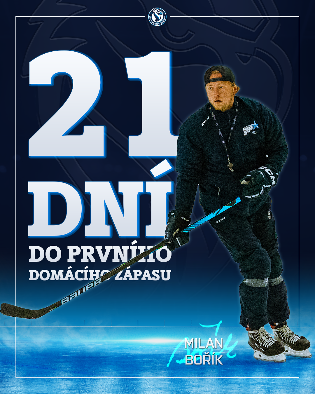
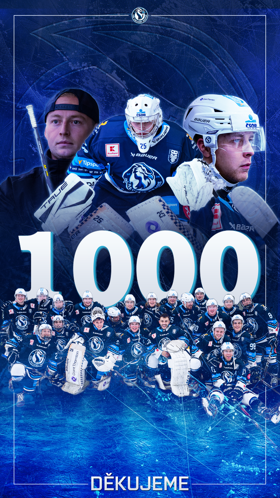
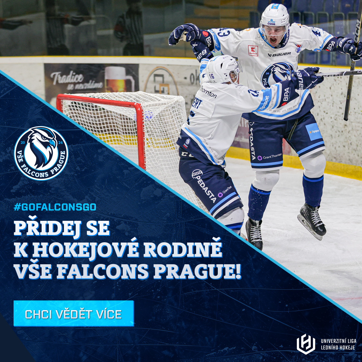
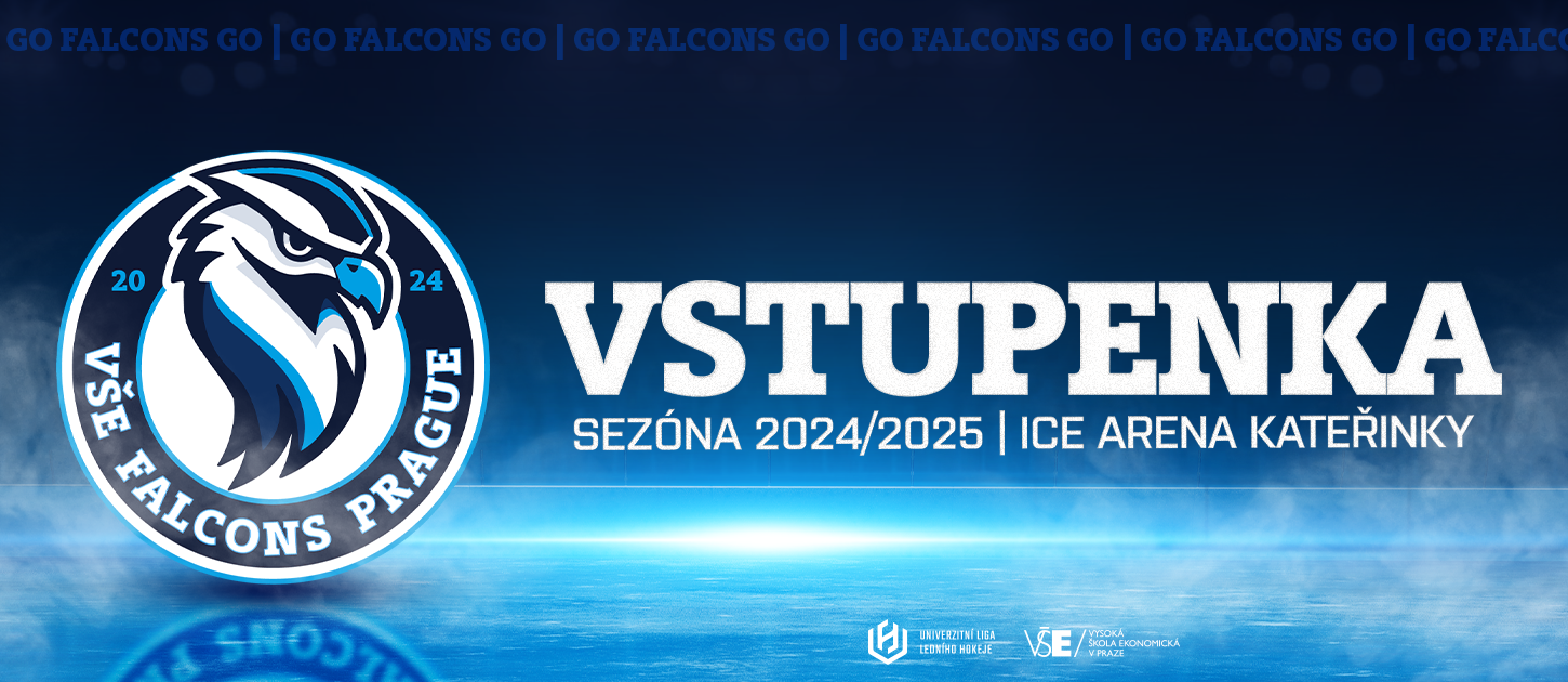
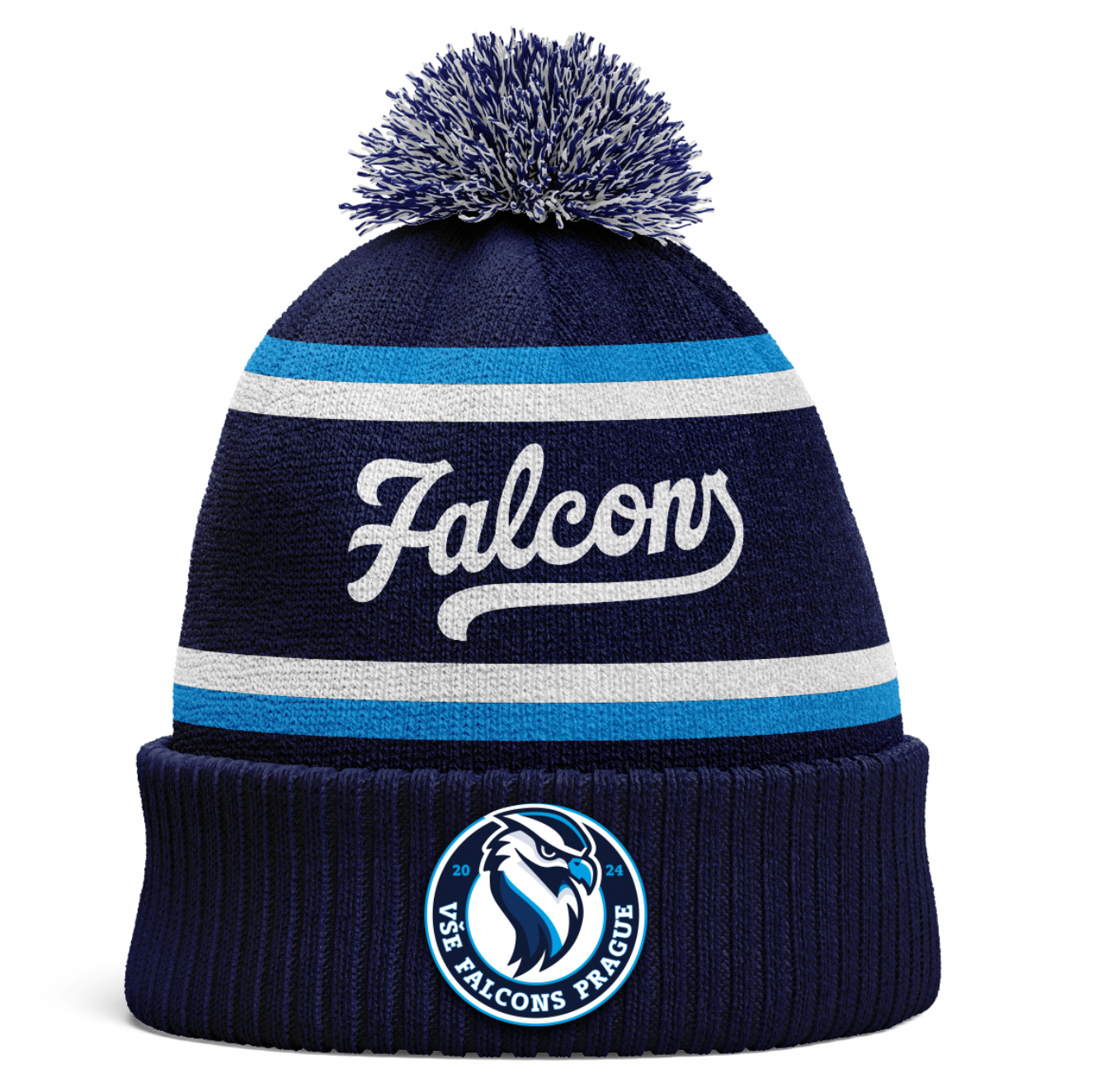
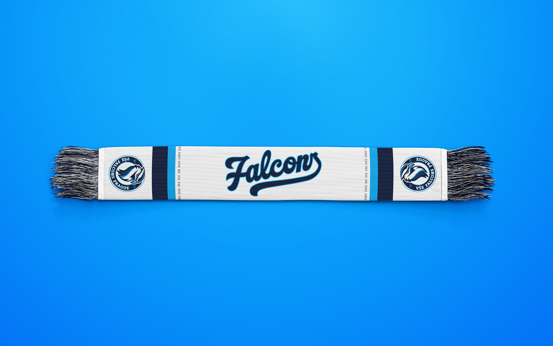
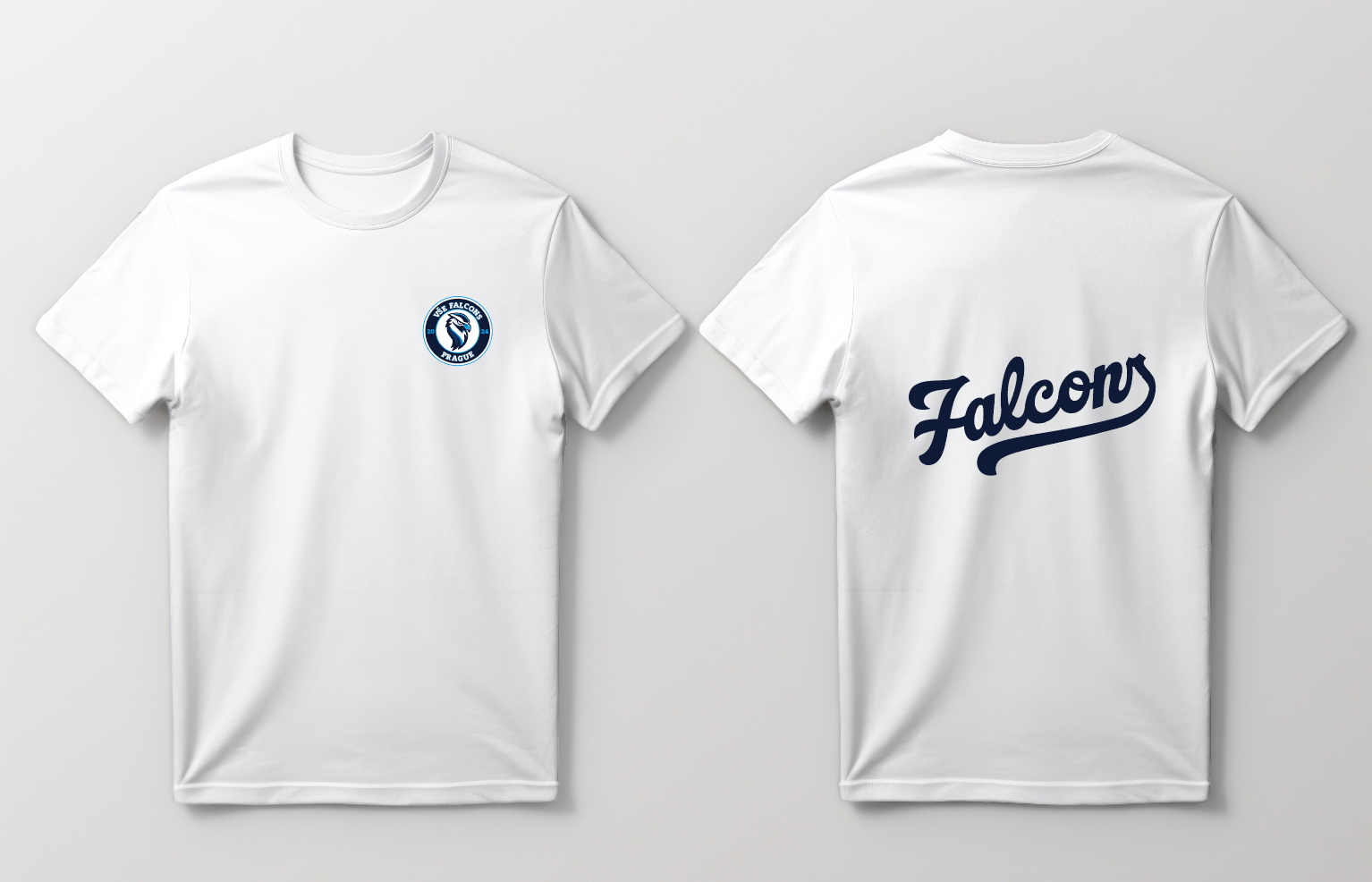
- Print & social — roll-ups, tickets, season visuals, day-to-day content
The hard part
Starting from nothing was the challenge — going from an idea in everyone's head to a finished, printed, working brand, one weekly meeting at a time. And with five founders, we didn't always agree. What made it work was splitting the club into areas each of us understood best and trusting each other inside them. Brand, visuals, communication and the overall marketing were mine — from the crest to the content that filled the channels.
The result
I built and led a 4-person content team producing the club's online and offline material. In 18 months, the brand generated 2.1M+ views and 240K+ organic reach, and supported 2,500 ticket sales — a full identity, built from zero, that students actually recognized and showed up for.